Smaller Models Visualised using CSS
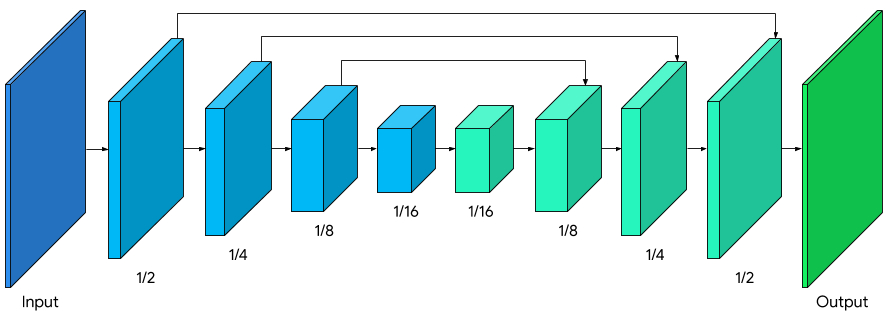
The smaller model structure became breakthrough of getting Learning to See online and functional. While developing the WebGL CNN I was constantly drawing representations of models and I really found the value in the diagrams you commonly see in ML papers:
Source: Background Features in Google Meet, Powered by Web ML
Thus I felt visualising the size of the model itself is a valuable thing to do to help gain an intuition of how hefty the model it is, and what this will ultimately mean for performance (in all senses of the word: ability to generalise, liklihood of overfitting, size in memory, inference running time, etc.).
Below is the original Pix2Pix model, to scale, and then the two other sizes which are on the Learning to Learn to See web app, each being Large, Medium and Small respectively.
I’ve gone for a slightly unconventional flattened-TIE-Fighter layout (the convention being the image above), but to keep things to scale, in perspective and all on screen at once this was the best solution. With the layout above, the middle layers would be really wide and make the overall graph too big.
Turns out that much 3D CSS can be quite a lot for the browser to handle! I’ve removed the back and bottom faces as you don’t actually see them, and turned off animations if there are more than one on the page, but don’t be surprised if this page is a bit slow. I’ll worry about it a bit more another time.