CSS Tensor Visualisations
I’ve been wanting to try using CSS 3D Transforms for a while and making some CSS versions of the types of graphs seen below seemed like a good opportunity.
This guide was the starting point for learning how to make 3D volumes using CSS. It’s easy enough to add a transform: rotateY(20deg) or something to a HTML element and it’ll do 3D stuff. But there is some moving and translating you need to do to make a 3D volume.
Each face is a <div> where the width and height is the size of that particular face, thus for a cuboid form you need 6 <div>’s. Each face needs manipulating in it’s own particular way, so if you’re only wanting 1 volume its easy enough to manage, but the CSS gets kinda hairy. To make a graph like the one above would need a lot of volumes, each with it’s own properties.
So it also seemed like a decent use-case for a custom HTML element. Custom HTML elements are a bit like React components in that they are a self-contained package with HTML, CSS and even Javascript features which you can then drop into HTML as a <my-custom-element></my-custom-element>.
As with all things web-related there many ways to declare a custom HTML element, but they’re all variations on the same idea. You create a new template HTML element which is the blank slate, then fill that template with some CSS; other HTML elements; some JS if you want and if you intend to put other HTML element inside your custom element you need to declare a space for it with a <slot>.
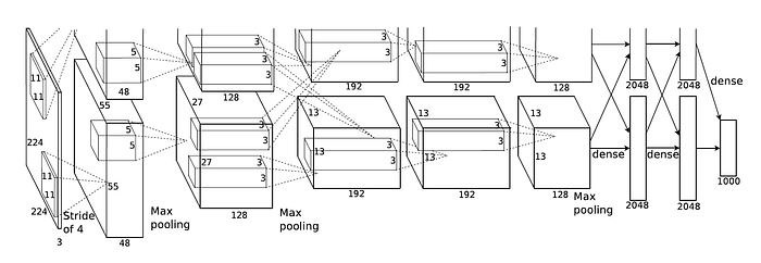
Here’s my version of the AlexNet graph (the bottom half of it anyway):
As you can see there are some pros and cons of drawing everything to scale, but I quite like to see it drawn like that, it gives you a good sense of the literal size of the model.. The last fully connected layers are actually half as long as they should be, at full length they make the page massive and make the scrollbars go all weird.
This is declared in HTML as:
<tensor-graph height=400 perspective=1000 animate=true>
  <tensor-box height=224  depth=224 width=3   z=0</tensor-box>
  <tensor-box height=55   depth=55  width=48  z=1></tensor-box>
  <tensor-box height=27   depth=27  width=128 z=2></tensor-box>
  <tensor-box height=13   depth=13  width=192 z=3></tensor-box>
  <tensor-box height=13   depth=13  width=192 z=2></tensor-box>
  <tensor-box height=13   depth=13  width=128 z=1></tensor-box>
  <tensor-box height=2048 depth=1   width=5   z=0></tensor-box>
  <tensor-box height=2048 depth=1   width=5   z=0></tensor-box>
  <tensor-box height=1000 depth=1   width=5   z=0></tensor-box>
</tensor-graph>
The <tensor-graph> is just a wrapper which you need so all the containing elements are rendered with the same perspective, delcared in CSS. You can see that the can make up your own attribues, which I think is also true of any HTML element. The width, height and depth are a bit mixed up, but it doesn’t really matter. As they’re all CSS elements they’re automatically placed using float: left.
The custom element is declared like so:
class TensorGraph extends HTMLElement {
  constructor() {
    super();
    const height = this.getAttribute('height');
    const perspective = this.getAttribute('perspective');
    const animate = this.getAttribute('animate');

    const template = document.createElement('template');
    template.innerHTML = `
      <style>
        :host {
          display: block;
          position: relative;
          text-align: center;
          width: 100%;
          height: ${height}px;
          perspective: ${perspective}px;
        }
      </style>
      <slot>DEFAULT</slot>
    `;
    const shadow = this.attachShadow({mode: 'open'})
    this.shadowRoot.appendChild(template.content.cloneNode(true));
  }
}

class TensorBox extends HTMLElement {
  constructor() {
    super();

		{ ... }

    const shadow = this.attachShadow({mode: 'open'})
    this.shadowRoot.appendChild(template.content.cloneNode(true));
  }
}


customElements.define('tensor-box', TensorBox);
customElements.define('tensor-graph', TensorGraph);
I won’t go into it in any detail, but you get the idea. I’ve omitted a lot of stuff in the TensorBox component because that is where all the hairy CSS is. But the nice thing about this method is that all the template contents are in a big template literal so you can just substitute in all the values for translating/rotating etc. based on the dimensions passed as attributes. Here’s a snippet:
.box {
  position: relative;
  width: ${width}px;
  height: ${height}px;
  float: left;
  transform-style: preserve-3d;
  z-index: ${z};
  margin: 0 0.2px;
  transform: ${translation} rotate3d(1, 0, 0, ${rot}deg);
  ${(animate ? 'animation: oscillate 10s linear infinite' : '')};
}
This is how the images are passed into the element and then used as backgrounds for the top face <div>s. The <slot> in where the TensorBox’s go when placed inside the parent TensorGraph. As it’s all CSS you can apply CSS animations which is how they’re endlessly oscillating.
They’re not particularly performant, if you put too many on a page it struggles.. This page is certainly feeling it, but a fun experiment in CSS non-the-less!